Storyblok CMS is a powerful heedless CMS platform for making enterprise grade websites.
All of 2023 I have worked extensively in building and StoryBlok CMS for an ecommerce website that uses Next.js, Tailwind, and Typescript.
Tons of learning on best practices of using Storyblok CMS.
If you can incorporate these practices there are 3 big benefits
- The CMS becomes super easy for a non technical content administrator to update
- Page size becomes lighter and pages load faster
- Developers can easily reuse components (or stories) and build new pages or make changes effortlessly
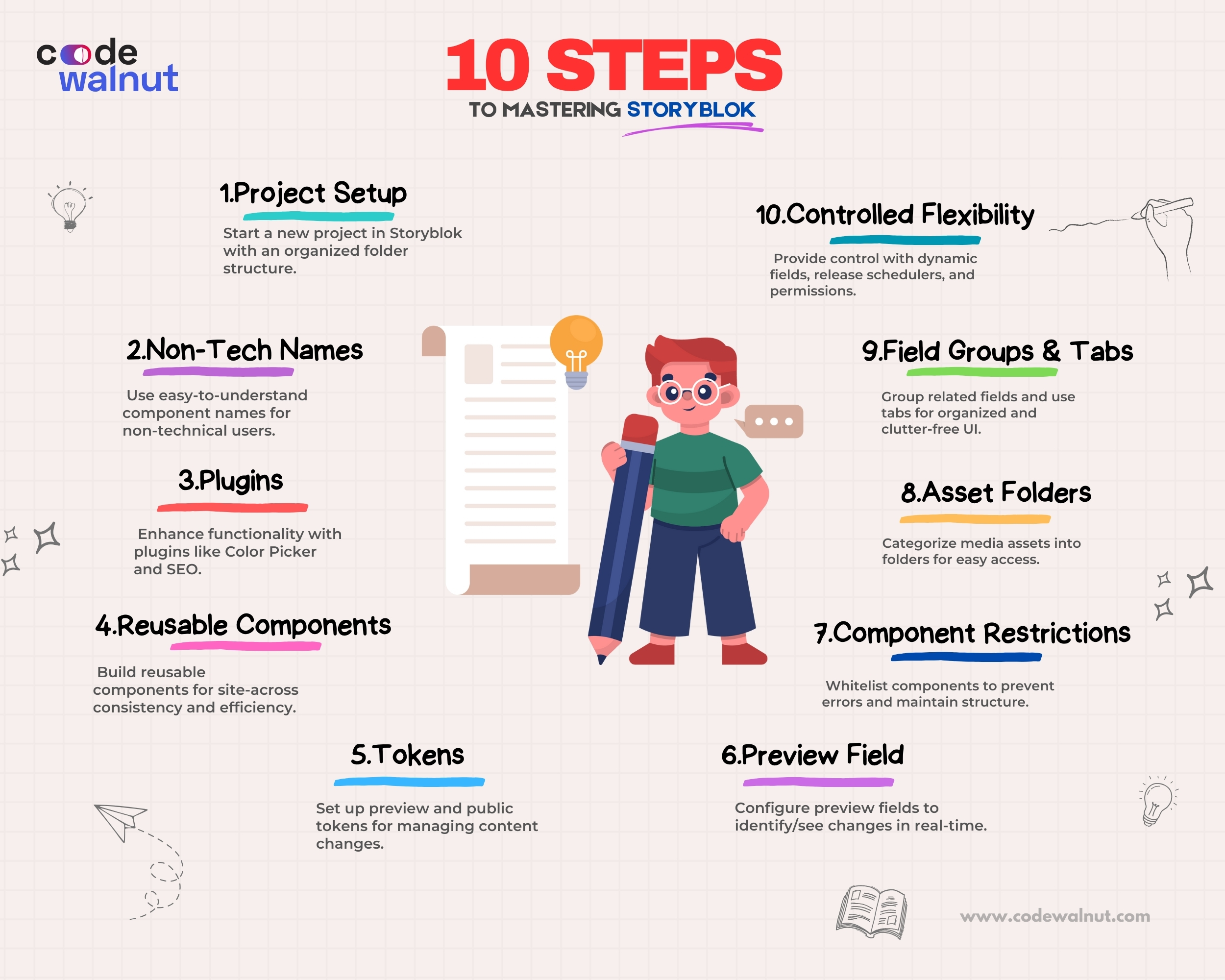
10 steps to create ‘a great story’ in Storyblok
- Non-tech nomenclature
- Use plugins
- Create reusable components
- Preview and public tokens
- The ‘preview’ field
- Restrict components
- Categorizing assets into folders
- Grouping fields and dividing tabs
- The right amount of control
- Dynamic fields and release schedulers
1. Non-tech nomenclature
As developers, we are so used to naming components/elements in the coding jargon.
As obvious as it is for us to go with our habit, it’s crucial to keep in mind that the majority of times, a non-techie is going to be the end user, and seeing words like array, boolean, p, h1, e.t.c will only make her/his life harder.
Well, there is some hope when it comes to semantic elements like section, header, footer, etc.
but not all the time; and, it’s almost hopeless when it comes to using non-semantic names for our components in CMS.
It’s really worth spending time coming up with an apt and easy-to-understand name.
The objective here is - any business user should be able to understand what a component does by looking at its name, without having to additionally learn technical jargon (“Hey Google, what is a Marquee?”, Instead just calls it a ticker)
2. Use plugins
Imagine a component where you need to give the content editing team the flexibility to choose the background color of their choice.
The brute force solution is to create a text field and read the color code from it. It can be done within no time.
Let’s see how a content editor would experience it.
Content editor: “Every time I need to pick a background for my content, I need to google the hex code of blue color and then append ‘#’ as the prefix and enter in the CMS.
If I miss the # or if I change the sequence of it, the component doesn’t work, it’s a bit of an annoyance every time.”
Now Imagine using the ‘Color picker’ plugin instead of a text field
Content editor: “Whenever I need to change the color, I can just pick it from the component itself”.
Also, notice there is less chance for the editor to miss the format which means fewer chances of breakage.
You see the difference? That’s why plugins can be a real savior. They save a lot of time.
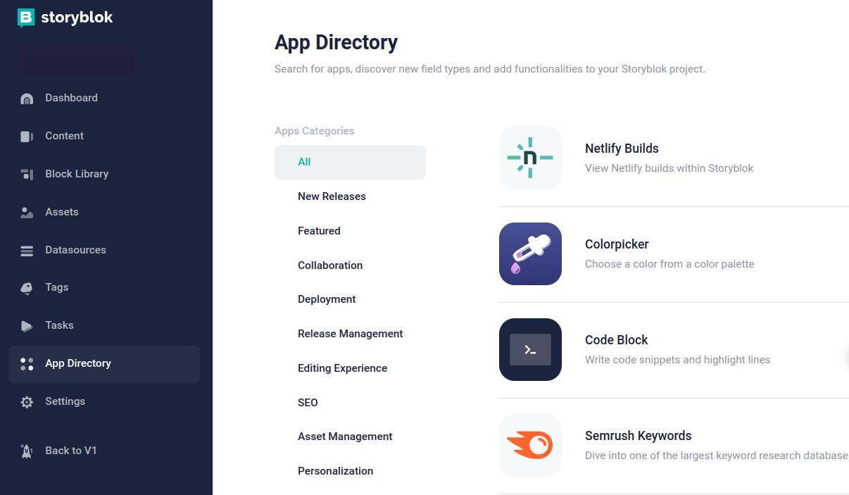
Plugins are available in the ‘App directory section’ of Storyblok.
Before developing a component, go through all of the available plugins and find out which one you can use to make the editing experience better.
Color picker, SEO, Replace assets, Export and Import translatable fields, and Releases (a new update on this is available on point 10) are some of the plugins that are often used.
3. Create reusable components
Take a look at these two components and decide which is a better approach and why.
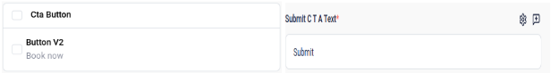
The left one is the right choice!
Because it enforces consistency in all the buttons across the space, so, if the user understands how one button should be configured, he/she pretty much knows how to work with the buttons in the rest of the space as opposed to understanding how each component is configured differently; which is a lot of cognitive load.
This has a big advantage for the codebase as well, as you are making the components reusable, you have a less bloated and more optimized codebase (and you also know that one change that can fix all the buttons across your entire website 😉)
There is one catch here. Even before you start developing the first component, spend time ascertaining common patterns across components and see how they can be replaced by a reusable component.
Say all the buttons on the website can be one single component that has different variants.
Counterintuitively, it fastens the development rather than slowing it down.
4. Preview and public tokens
We had two spaces, one for production and one for staging.
While it’s a good practice for the dev team to have it, it was tedious for the content team to make 248 changes all over again in the production space.
After all, the point of creating software is to minimize manual efforts.
We can eliminate the duplication of efforts by using the ‘preview’ and ‘public’ tokens.
The preview tokens will have the content from the draft version (when you hit the save button) and the public token will have the content from the published version (when you hit the publish button).
The content team can save as many drafts and changes as they want, all of them can be tested in a separate deployment that uses the preview token.
As soon as they are good to go, just hit publish and they will be live with zero duplication of efforts.
You can create new tokens in ‘Settings’ -> ‘Access tokens’

5. The ‘preview’ field
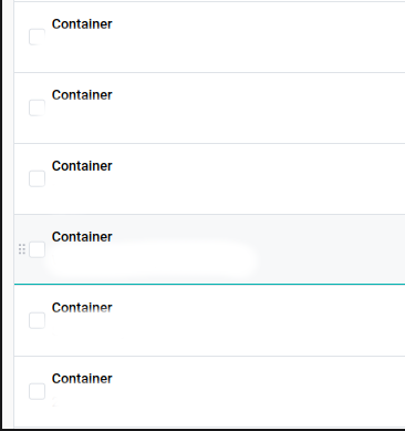
Observe the above image. Consider that you want to change content on a particular section of the page, how do you identify in which of the above containers it is present?
Go to the first section, check, come back, go to the second section, check again, go to …. you get the idea.
Now look at the second image
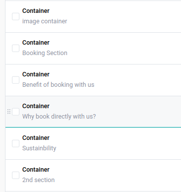
It’s a lot easier to identify it, right? You can do this by setting the ‘preview’ to the desired field. By default, it’s ‘Automatic’.
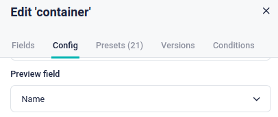
It looks like a small change but it’s a big gift for the content team, trust me!
6. Restrict components
Imagine your production app going down on a new feature release because the content editor inserted a wrong block into the component. Even the thought of it is scary 😰
When you define a ‘block’ field, by default Storyblok allows you to insert any block within the space which can break the application if all the possible errors are not handled.
To prevent such mishaps, you can whitelist the components a block field accepts by checking the ‘Allow only specific components to be inserted’ as shown below.

You can also set the minimum and maximum number of components allowed to enforce stricter rules.
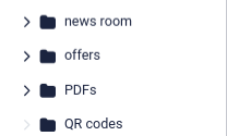
7. Categorizing assets into folders
We just upload all the assets required into the asset library and use them whenever needed.
What if you want the link to the terms and conditions PDF that was uploaded 6 months ago on the home page?
Unfortunately, it was named “pdf8740.pdf” and more than 600+ updates were made.
It would take hours to go through the version history, remember the date, and identify the PDF form there.
Create folders inside the assets and spend 2 seconds more to add it into a folder while uploading the image, this 2 seconds can save you hours of time and effort.
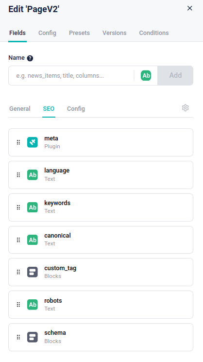
8. Grouping fields and dividing tabs

Look at the above component, text fields, numeric fields, image fields everything is put together.
When there are too many fields it can be a struggle to decipher which one updates the contents, which one to change to change the button, form field names, etc.
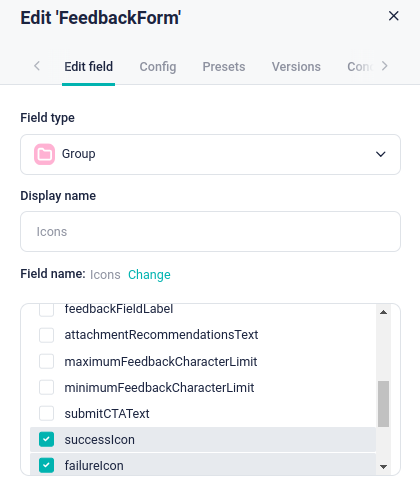
This commotion can be avoided by creating a ‘group’ and adding all the related fields into it accordingly.
You can do this by creating a new field ‘group’ in the block settings as shown in the above image.

Looks pretty organized, innit?
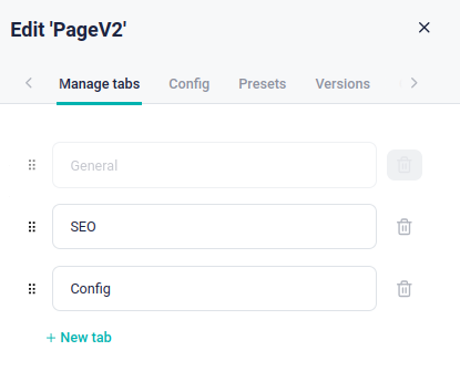
One level further, when there are multiple types of sections in a component, you can also create tabs and organize them to avoid cluttering the component UI.
Say when you want to add an SEO section for the page you can do this.
To configure a new tab, you can click on the settings icon next to the ‘Config’ tab as shown below. Adding a component to a tab is simpler than grouping.
As shown in the above image, just select the tab in which you want to add a new field, name it, and add it. It will automatically be moved into the selected tab.
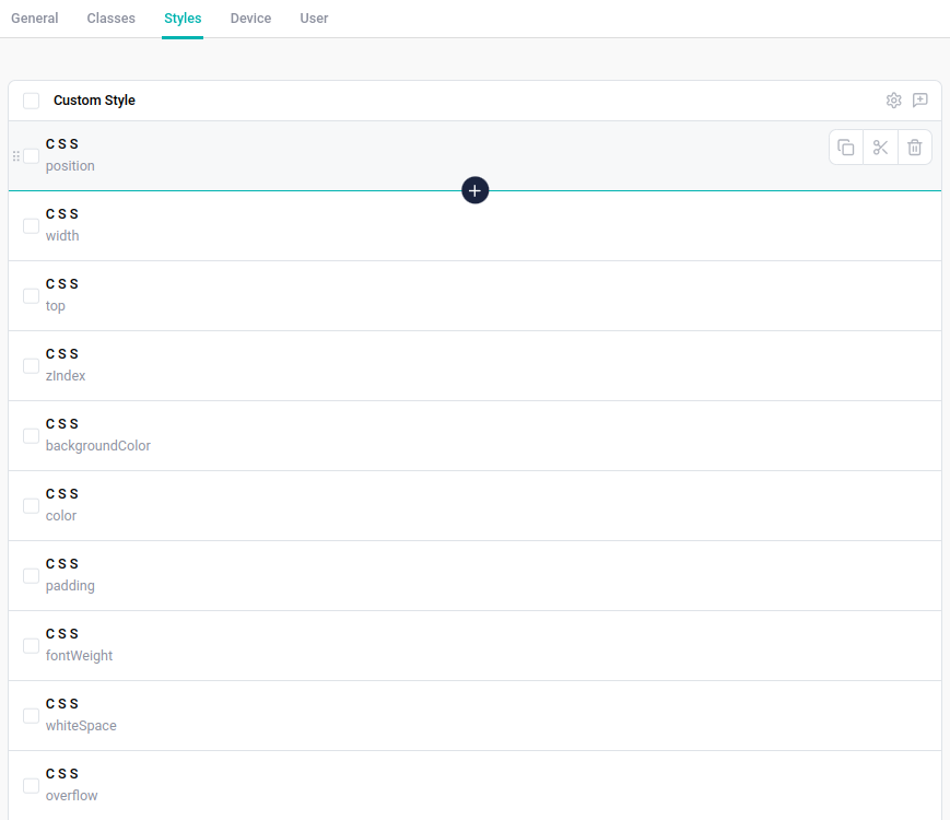
9. The right amount of control
One of the most important takeaways is to learn how much control to be given to the user.
Storyblok is flexible in creating JSON, and adding every single customizable piece of code into the CMS will make it incredibly hard for a non-techie to handle it and she will inevitably get frustrated and end up resentful.
Look at this image below. It felt euphoric when I created the classes and styles section and figured out how to style almost every component in the codebase without needing a code change.
It meant you would not need a single deployment to do any amount of CSS styling changes to the application.
But not so later, the euphoria turned into distress.
The content team was overwhelmed as they were clueless about CSS and classes.
I decided to empower them by teaching them about how CSS works.
The rabbit hole only kept going deeper as I had to explain inline styling, universal selectors, element selectors, specificity, parent inheritance, and whatnot.
With too much control over the component’s styling, they went through unwanted distress and chaos.
We later refactored them to only have dropdown options like primary, secondary, etc
The lesson here is to make the editor's life easier by providing only what’s necessary for the time being. Nothing more, nothing less.
10. Dynamic fields and release schedulers
“It’s a challenge to create reusable components in Storyblok”, I said to myself while tossing and turning on my bed.
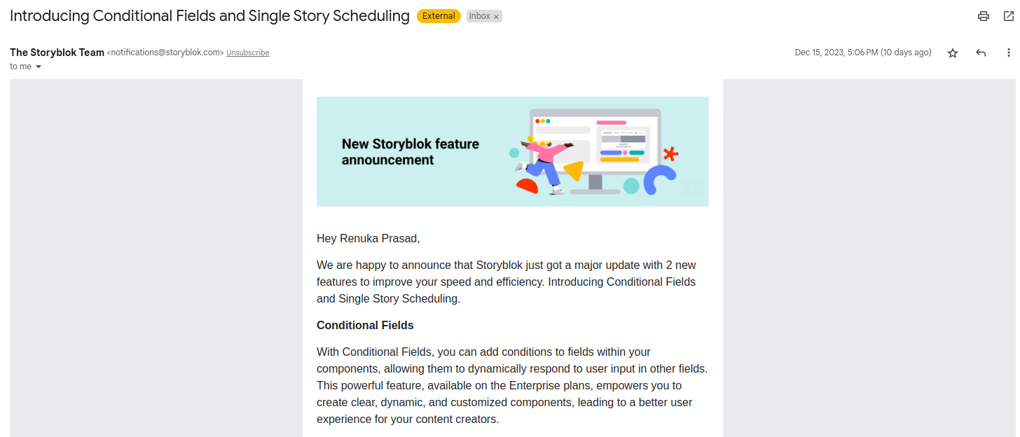
After two days I saw an email saying “Introducing Conditional Fields”.
OMG, was I speechless! (“How did they know what I was thinking?”, Like for real)
The reason why it’s necessary is that when we develop reusable components, sometimes there are some fields that aren’t necessary for a use case. Look at the image below.
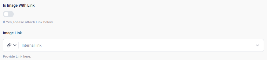
When there is no need for the link, I just don’t need the field at all.
It’s just junk data in the JSON which also ends up increasing the page load speed when done on a larger scale.
Of course, we don’t want this, but there was no way to remove this.
Instead, we had to create a new component if we wanted this field to be removed, resulting in duplication, both in CMS and the codebase.
Fortunately, Storyblok just introduced a new setting to allow us to conditionally render fields.
We can do this by editing the ‘Field conditions’ in the block settings.
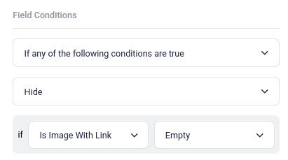
In this case, I’d say ‘Hide this field if the image does not have a link”.
Along with this ‘Single Story Scheduling’ has also been introduced.
Earlier we had to install a plugin called ‘Releases’ (as mentioned in point no.2) but now we won’t need it anymore for single story schedules.
I’m excited to try them out and make the space better and better everyday.
Conclusion
Storyblok is doubted to be a fit for large enterprises. But remember,
“With great power comes great responsibility” says Uncle Ben to Spider-Man.
This is very true for us as well. Carefully crafting this headless CMS by incorporating the above points will boost your enterprise grade content heavy application to ‘serve seamlessly’.
Until next time,
Renu


 When to Hire CodeWalnut?


